The ONE thing to know to understand business intelligence

Data and Analytics can be quite daunting, but if you’re just starting with BI there this ONE thing, this one transformation, which explains 95% of all reports: ‘group by’. This article will take you from the data as starting point, through the ‘group by’ transformation, to the generation of reports like line graphs, bar charts, tables and more. (tl;dr)
Business Intelligence is about analyzing data, specifically about generating insights from it. Data may is often extensive and may contain a lot of insights and you will need a transformation to extract and condense a specific insight from it.
Where it starts: The Data
The data you start with is generally a table, where each row contains information (observation) about an object, a fact or a summary of facts. An object may be for example a user, a fact may be an event like a download and a summary may be the daily numbers of new customers. Each row contains the same types of information, the attributes of the objects which are put into the different columns of the table. Depending on the type, the attributes contain texts, numbers or dates.
The attributes a generally also separated into dimensions and metrics and we will need this distinction later in the ‘group by’ transformation. While this separation is not strict — you could use some attributes as dimensions or metrics — one would generally define text and date attributes as dimensions and numeric attributes as metrics. The important property of metrics is that you can use mathematical operations like sums or divisions to combine different attributes of the same object or attributes of different objects. So for example if you have two users with different ages you could calculate an average age for both users. This is not possible for dimensions, e.g. if one user comes from Berlin and the other from Paris you wouldn’t be able to calculate an average city or even a sum of cities.
Figure 1: Example data table. Note: the left column and the two top rows in the table above are not really part of the data and are just shown here to illustrate the different components of the data table.
That’s already all you need to know about the data. Of course there are joins, data cleaning, abstruse SQL Ninja operations that may be needed to get to the describe table, but that you can leave to your analytics or data engineers for now.
The ‘group by’ transform
As stated before, the data tables can be quite long and confusing to look at directly. We need to condense it to generate insights. This will be done by A) selecting only specific attributes and B) by grouping rows together. Let’s stay with the car data from above and try to get an insight about whether cars in some cities are in average older than in other cities.
The first thing to do is to group the rows of the table into groups according to the city the car is sold in.
Grouping alone will sort the data by the values of the dimension ‘city’ but not really reduce complexity. What we want is just one row per city. We do that by aggregating the groups. The dimension ‘city’ has only one distinct value per group (because we grouped by city) which makes it easy to aggregate it. For the metric ‘age’ we need to reduce the group of different age values to a single value per group. For getting the insight as described above we take the average of all values in a group.
With the table above we get the insight we were looking for. The complexity is gone. We have lost all other dimensions during the ‘group by’. That’s fine as we don’t need them for our insight and aggregating other dimensions is anyway not giving meaningful results. Also the the other metrics we have left out, even though it would have been possible to calculate for example the average milage per city. But that would have been a different insight.
Grouping by multiple dimensions
So grouping is done by dimension values and then insight are generated by aggregating metrics. It is also possible to group by more than one dimension.
In this case there exists a group for each combination of the values of the dimensions. The aggregation (in our case the average of the ages) is then done for each of these (smaller) groups.
Dates
Similarly to grouping by text you can also group by date dimensions. In our cars example it is for example possible to group by the registration date. The groups would then consist of all cars with the same registration date. Instead of using the date directly you could also extract the Year-Month from the registration date (combination of the year and the month of the date, like “July 2022”) and group by this newly generated dimension ‘registration month’. The groups would then contain all cars being registered in the same month.
Analyzing the average age per registration month wouldn’t be very insightful. Let’s take a different metric. In every table there is always a hidden metric often called ‘record count’. This will count the number of objects in the table, i.e. in our case the cars. You can imagine this as an additional column ‘num. cars’. As each row represents one car in the original data table, this will lead to a column with all ‘1’s. Now we can aggregate this metric using a sum, resulting in the number of cars with a particular registration month giving us an insight how the number of car registration evolved over time.
Building reports
The ‘group by’ transformation can be implemented in SQL or even in Excel as pivot table. However, you don’t have to do it yourself. Every BI tool will do that for you in the background if you drag the desired dimensions and metrics in the corresponding fields for the x or y axes of the report.
Let’s have a look at popular report types and examine how the aggregated tables is used. All reports are based on the original data table from the top of this article (of course with more rows). For each example the intermediate aggregated table is shown together with the resulting report graph.
Table / pivot table: of course the aggregated table can directly be used as report. For multiple dimension this can also be shown as pivot table where one dimension is displayed along the x-axis while the other dimension spans the y-axis. For the average age per city and brand this would look like:
Bar chart: each bar represent one group. The length of the bar is the aggregated metric. The graph will usually show only a maximum number of bars if there are too many groups.
Pie chart: each segment represents one group. This will only work for metrics that sum up, like the number of cars. The arc length is the fraction the cars per city in comparison the the total number of cars. If too many groups exists, the BI tool will aggregate the smallest groups into a ‘other’ segment usually.
Line graph / time series: for a time series you need to group by the date and use it for the x-axis. This works on any date granularity like days, weeks, months, quarters or years. Note: you could also display more than one metric in which case you would get 2 lines in the graph
Stacked graph: Reports may support more than one dimension. Line and bar charts may use one dimension for the x-axis and the second dimension to stack segments on top of each other. The metric then defines the height of the different segments.
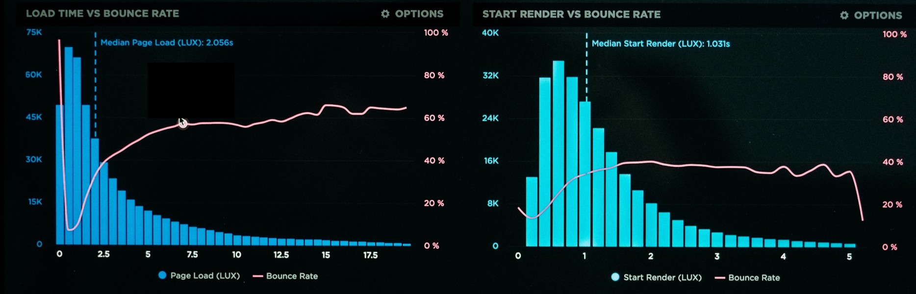
Histograms: this report is a bit special because here a metric is actually translated into a dimension. For example the values of the metric ‘age’ are translated into distinct bins (representing value ranges) and then the ‘num. cars’ metric is aggregated as sum.
Takeaway
The above report types represent the vast majority of reports in business intelligence. They all follow the same logic of first grouping the original data set by one or more dimensions and then aggregating a number of metrics. Understanding the basic concept of the ‘group by’ transformation helps learning the principles behind insight generation in business intelligence. If you have any questions or comments let us know.